Tab2
SimpleKivy.SimpleKivy.Tab2(panels={}, k=None, tab_pos='top_left', do_default_tab=False, head_label_args={'size_behavior': 'texth', 'padding': [16, 0, 16, 0], 'lcolor': 'gray'}, content_box_args={'lcolor': 'gray', 'padding': 4}, strip_args={'bcolor': [0.2, 0.64, 0.8, 1], 'pos_hint': {'bottom': 0}}, **kwargs)
Dynamic Tab2 widget constructor. An enhanced version of the Tab widget with a modern look.
Parameters
panels: dict
Defines the content of the tabbed panel.
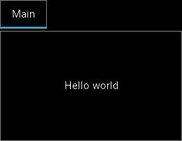
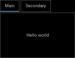
{"{tab_name}": Widget, ...}: For eachkey: valuepair, a TabbedPanelItem is created withtext = "{tab_name}"and Widget added as child. Each TabbedPanelItem created is added as child to the main TabbedPanel widget.
Defaults to
{}.
Example:
1
2
3
4
5
6
7
8
sk.Tab2(
        panels={
            "Header1": sk.Label('First tab content'),

            "Header2": sk.Button('Second tab content')

        }
    )
head_label_args: dict
Defines the properties of the headers, which are created as
sk.Label(text = "{tab_name}", k = sk.NOTKEY, **head_label_args).
{"{prop_name}": prop_value, ...}: Dictionary of properties.
Defaults to
{'size_behavior': 'texth', 'padding': [16,0,16,0], 'lcolor': 'gray'}.
content_box_args: dict
Defines the properties of the the content box, which is created as a
SimpleKivy.kvWidgets.BoxLayoutB(**content_box_args)widget.
{"{prop_name}": prop_value, ...}: Dictionary of properties.
Defaults to
{'lcolor': 'gray', 'padding': 4}.
k: None, str, or NOTKEY
Key specification for quick acess:
None: Automatically sets an int value.
str: Use specific string key.
NOTKEY: Special flag indicating no key should be used.
size: str or sequence of 2 ints
Size specification of the widget:
str: "x{width}": Sets widgetwidthandsize_hint_x = None.
str: "y{height}": Sets widgetheightandsize_hint_y = None.
str: "xchildren": Setssize_hint_x = Noneand binds this widget’s width to the sum of the widths of its children.
str: "ychildren": Setssize_hint_y = Noneand binds this widget’s height to the sum of the heights of its children.
str: "xchild_max": Setssize_hint_x = Noneand binds this widget’s width to the child with the maximum width.
str: "ychild_max": Setssize_hint_y = Noneand binds this widget’s height to the child with the maximum height.
You can combine up to two of the above size string specifications.
str: "{number}": Processed assize = (number, number)andsize_hint = (None,None). Cannot be combined with other string specifications.
sequence: (int, int): Size of the widget. Same asKivy. Has no effect ifsize_hintargument is not set toNone.
Example:
1
2
3
4
5
6
7
sk.Tab2(size = "y35")
sk.Tab2(size = "x120y35")
sk.Tab2(size = "xchildreny40")
sk.Tab2(size = "xchildrenychildren")
sk.Tab2(size = "xchild_maxy40")
sk.Tab2(size = "60")
sk.Tab2(size = (120,35), size_hint = (None, None))
enable_events: bool
Whether the widget will send events to the event_manager set in MyApp using the widgets
k/idproperty as event identifier.
True: Triggers events.
False: Doesn’t trigger events.
on_event: str, iterable (tuple or list), dict
Defines which events/property changes will trigger the event_manager. Only has effect if
enable_events = True.
str: Name of the event or property that will trigger the event_manager.
iterable: [str, str, ...]: Will trigger events for each name in the iterable.
dict: {"{event_name}": callback}: Callsinstance.bind(**on_event)during widget creation.
Example:
1
2
3
4
5
sk.Tab2(enable_events = True, on_event = 'width')
sk.Tab2(enable_events = True, on_event = 'on_touch_down')
sk.Tab2(enable_events = True, on_event = ['width','height','pos'])
sk.Tab2(enable_events = True, on_event = {"size": lambda ins,v: print("size =",v)})
do_dot_subevent: bool
Adds a “.” to describe the event when triggering the event_manager.
True: The event identifier isstr(widget.id)+".{event_name}".
False: The event identifier is the same as the widget’sk/id.
Default is
False.
Returns
New TabbedPanel-like widget created dynamically with panels processed as displayed content during creation.
Kivy Bases
TabbedPanel
current: (str): `Text value of the current tab selected. Setting this property changes the current tab.
This page only details the new or modified features. All other parameters inherit from the base Kivy widgets and can be found in the official Kivy documentation.